My affection for the ruling pen and India ink is pretty well established by now. I’ve used them by themselves for drawings and in harmony with other materials, like markers and watercolor paints, when I wanted to add color to the bold, black lines. This abstract, broken glass inspired, piece brings back the watercolor paint and adds a new element to enhance the dimensionality.
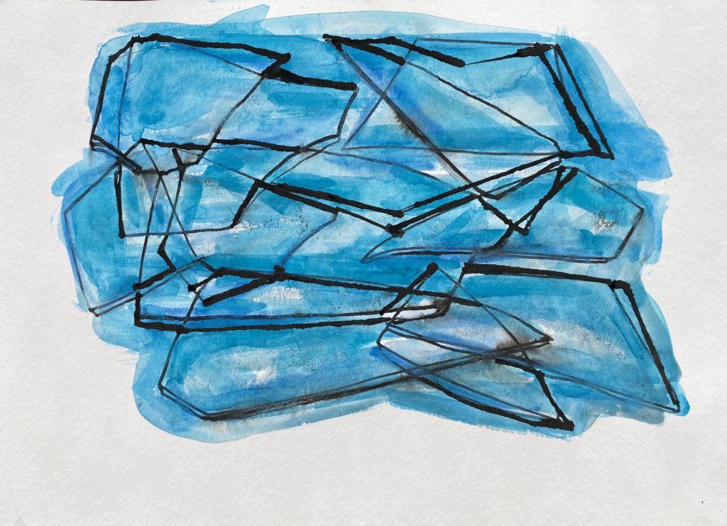
In these types of art projects, I generally put color down first and then follow with ink, but today I wanted to switch things up. Do something opposite, yet similar and, once again, try to work with those angular, geometric lines I struggle with.
I got out my triangle and transparent ruler and began to create a balanced design. I made some lines thicker, some lines longer, and tried to keep the distance between the lines visually appealing. Then I mixed up some blue watercolor paints in several shades and tones to enhance these lines, creating interest and direction.
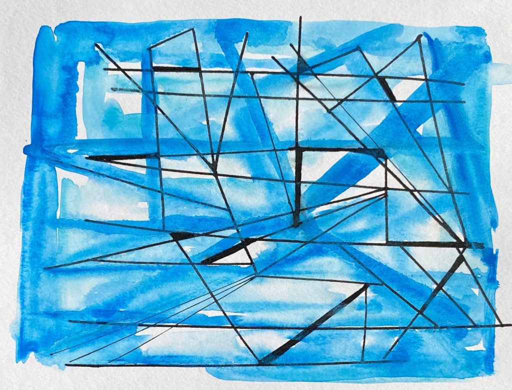
Once it was done I thought it looked nice, but the piece did not accomplish what I wanted to accomplish. The blue border changed the look, creating something almost like a window. Contemplating what to do next, I had a light bulb moment! This piece resembled broken glass, which I found really exciting to explore, so I began to intensely get into my trials and testing.
Setting more clear intentions for my artwork can definitely help me focus, but it also puts a bit of pressure on my expectations of the piece, so I try to remember to follow my artistic mantras of “practice, practice, practice” and “practice doesn’t make perfect, practice makes you confident”. If what ends up on the paper does not match what I see in my mind’s eye, I can learn from my attempt and apply what I learn to my next trials.
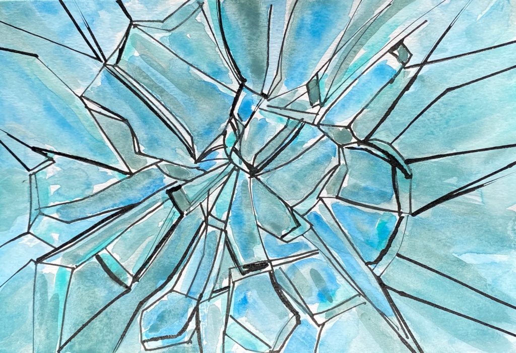
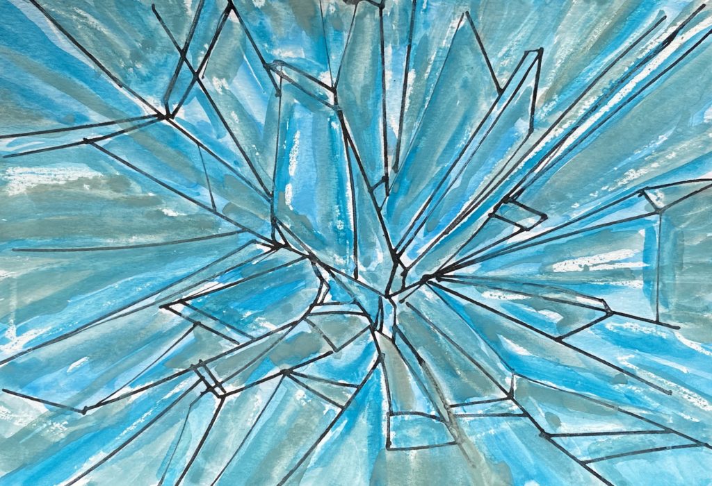
The first thing I needed to do was go bigger with my ink drawing. In practicing the bigger drawing, I also tried keeping my triangle and ruler to the side and created the straight and angled lines free hand. The blues were the same as I used in my first try, yet I left less negative space and used more blue to fill in more positive areas. This brought about a finished piece that resembled crystals and changed the look entirely. I liked it, and appreciated the transparency I created, but it still did not look like broken glass.
With my second try down and my third on my mind, I took some time to view photos of broken glass and further focus my ink drawing. I also noticed the variety of colors and reflections in broken glass photos, so I began to test other colors (including reds for reasons I can’t explain).
This trial looked better to me, as it had more dimension and direction.
I try not to replicate others artwork or over research actual pieces of art when I need inspiration. Yet, before I began my next practice piece, I felt I needed to see how other artists viewed and provided the broken glass look. After seeing the similarities and unique qualities of my work in comparison to what other artists were doing with the same subject, I felt mine were pretty darn good! This pumped up my confidence and desire to keep working with this subject.
Creating a bigger ink drawing had helped, the color changes had helped, and having examples to look at had helped. I knew I was on the right track.
I was ready for trial four and decided to try to add another material in the mix: a white crayon. Why would I use a waxy, white crayon? I wanted to leave the reflection in place prior to using the watercolor, to make it easier and faster to paint. Crayons allow resistance to the paint, leaving the white to represent the shines on the surface.
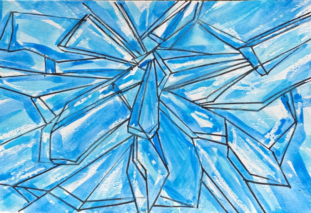
I was so very happy with this addition but wasn’t as happy with my choice to return to the icy blue colors. I wanted more realistic looking glass.
So with all this knowledge and hands on learning, I was courageous enough to film a final piece. To get ready I prepared my colors ahead of time, looked at my past trials as well as the photos of broken glass and other artist’s interpretations. As calmly as I could, I got to it!
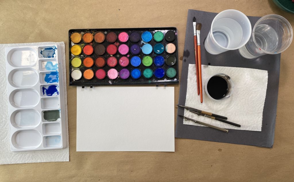
The materials I used in this art project:
- Ruling pen
- India ink (Could substitute the ruling pen and ink with a very fine, black, permanent marker)
- Heavy grade white paper
- Watercolor paints
- A paintbrush
- A white crayon
- A paint palette or plate for color mixing
- Cups filled with water
- Optional materials are a ruler, triangle, or other straight edge
The steps I took in this art project:
- Mix watercolor paints to achieve different colors and tones to represent the dimensionality of broken glass.
- Using the ruling pens and India ink on the white paper, draw straight lines, connecting them to create the appearance of broken glass.
- After the ink has dried, use the white crayon to highlight the areas in the piece where there would be shines or reflections.
- Paint, using the different colors you mixed in step 1, to create the look of broken glass until you feel it is finished.
- (Optional) Start over with a new sheet of paper and keep practicing!
Here is the completed artwork from the above time-lapse video:
I am proof that no one is too old or experienced to learn more, push themselves out of the comfort zone and fly forward. What a beautiful flight this was!